Book Review: Read Frame Type Film: Or, Written on the Screen
Amongst other things, MUBI is a streaming platform. Its more cerebral offerings counterbalances the bingeable monotony of “content” found on other platforms; where some boast quantity, MUBI fronts quality. This year they launched MUBI Editions, a discrete publishing platform aiming to “broaden the horizons of cinema-related publishing”. With only one released book (in review here) and one other in the pipeline, it is too early to get a sense of their overall reach and ambition, but there are more than cover-level differences with some of A24’s books, which are carefully designed and beautifully printed but ultimately destined for display purposes only. On the other hand, Read Frame Type Film: Or, Written on the Screen, MUBI Editions’ first publication, sits awkwardly on the bookshelf because of its unusual dimensions and it feels misplaced on the coffee table book stack because of its lack of ornamentation — it’s a welcome misfit in this overly style-conscious or otherwise textbook-heavy genre of publishing.
Read Frame Type Film is a book about the overlooked relationship between cinema and typography, it is proudly described in the introduction as an “anthology of marginalia”. Across an eclectic array of twenty-four experimental films ranging from 1926 to 1984 the three co-authors consider text and film from their respective vantages as specialists in moving image (Enrico Camporesi), art history (Catherine de Smet), and typography (Philippe Millot). They don’t hide the differences of their perspectives and they implicitly encourage the reader to develop their own too — the cover, afterall, looks like a screen awaiting projection and a viewfinder waiting for an eye. In Robin Kinross’ foreword he pulls attention to this kind of multiplicity of perspective: “The style of letterforms may mean something to those who design them, something else to those who use them, something else again—perhaps very little—to those who see and read these letterforms in use”. As such, throughout the book, it gradually becomes more clear that the co-authors are not necessarily wanting to change the way we see (or don’t see) type in film but that they are wanting to inform the way we see it. They are ultimately successful in this not because of the strength of their argument but by the conviction of their writing.
The films they write about range from works by Yvonne Rainer and Man Ray to Lis Rhodes and Michael Snow. The type they consider in the films is variably found in shots of everyday vernacular signs and typefaces (Dziga Vertov’s Shestaia Chast’mira), as features of advertisements (László Moholy-Nagy’s Impressionen vom alten Marseiller Hafen) as intertitles (Joseph Cornell’s By Night with Torch and Spear) and Posters (Len Lye’s Musical Poster No.1) as well as in the more mundane, overlooked elements of film in general like title sequences, end credits, and so on. The chapters don’t linger particularly long on each film but there is never a point of feeling shortchanged, each section is a slowburning and consuming read that’s perhaps best interrupted by watching (over and again) clips from the films online. It should be noted that there are no commercial mainstream films featured in Read Frame Type Film, rather the films included are generally from the “margins of the film industry” so readers looking for a finickity analysis of more popular films should look elsewhere.
Camporesi introduces almost all of the films, he gives them each a situation and a weight that draws in satellite ideas and associations. de Smet tends to follow on from Camporesi to relate the films to a broader, yet specific visual culture, and Millot uses what they have constructed as a platform to deliver typographically-focused insights. For instance, in the opening of the first section, Camporesi writes about the details of the “optical play” of spiraling motifs and rotating discs in Marcel Duchamp’s Anémic Cinéma whilst de Smet splices the literary material and formal elements of the film into historical contexts of Duchamp’s work from years prior, Millot then cuts back to describe the typography in a more headon fashion. Tonally, there is often something grounding in Millot’s contributions, specifically when he draws on personal experiences and writes in first person. At one point he reflects: “My first contact with A Sixth Part of the World [Shestaia Chast’mira] was not Vertov’s film, but a book by Michel Aubry”, there are many recollections like this, it’s subtle but they read as almost wistful. In a similar, upright but forthcoming tone, elsewhere he writes: “Let me come back for a moment to the sans serif alphabet [...]”. Considering the generally stiff and “proper” tone of the rest of the book, these fleeting lines breathe some humanity into the pages.
Despite the interplay between the voices of Camporesi, de Smet, and Millot this book reads far from conversational; the dependable flow of continuity of the chapters is ensured, however, by the films themselves which work as linchpins for the co-authors’ fastidious attention. This is a kind of attention that is getting at nothing but the material fact of type in a particular set of artsy films. Their curious way of doing this is by making their object of study as opaque as possible. Pierre Alferi says in his introduction, in fact, that “[y]ou could say that as soon as a sign is named, it becomes opaque”. As such, they are not trying to explain typography in cinema, that would be too transparent: transparency kills form, moves through form, passes beyond, underneath, and behind the form. They want to focus materially on the form itself, so they must make it tangible by giving it an opaque density. Perhaps this is why in Robin Kinross’ foreword he describes the book as embodying a “materialist” approach to film.
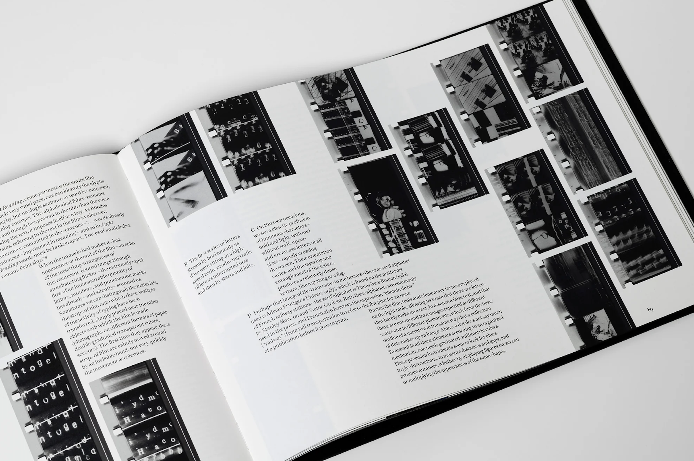
Editorially, the text blocks making up each chapter tack onto the ends of and run parallel to strips of celluloid from the film being written about. At times, the layout requires the reader to scan across the page as if it were a screen of images rather than a page of text. The images are reproduced from “frame enlargements” rather from the more typical production stills — in this way the book repeatedly emphasises that its concern is the physical object of cinema, not typography as an idea, ideal, or abstract conception; Read Frame Type Film is a material investigation. Because the images are printed so crisply and (probably) to scale it feels as if they have a physical weight on the page, so stepping back from the book laid open on a tabletop, from a distance, the illusion is that you are working hands-on with a tactile material. This image treatment is in contrast to the offcuts of thumbnail photographs left sporadically between the pages. They show projection equipment, people handling film, and so on — they look to be photographs taken from inside the Centre Pompidou film archive. It's an unusual addition, there is something flippant, playfully haphazard, almost offhand about these bits of ephemera which is odd considering how well-considered the design of the rest of the book is.
Overall, this is an often-esoteric book that takes itself seriously; it’s not an easy introduction to type and film and it doesn’t claim to offer any resolving final words, instead it starts in the middle and it firmly stays there, this is what makes it a challenging read, but it’s a worthwhile one for those interested in the subject. That being said, I’m not sure who the intended readership is, beyond the (likely) narrow audience of people interested in type and film specifically. A typographer would likely find the depth of investment in the films as an obscuring of their typography interests, and vice versa for the film enthusiasts. Overall, it’s an impressively well-researched and well-presented book, if this is where MUBI Editions begins, I’m curious to see where they will progress.