I wrote this essay shortly after my friend died. Several local newspapers reported his death, one headline read: “Legend of Darwen music scene, Jonathan Lindley, dies aged 32.” I shared a flat with Jonny for a couple of years while we studied design. I was in my first year, he was in final. When we lived together we made social those unsociable late working hours; it wasn’t uncommon to enthusiastically start a new project at midnight because every minute felt loaded with the possibility of doing something worthwhile. Jonny taught me not to be suspicious of the urge to be creative. I learned how to dedicate myself to ideas that felt intimidating by watching him do the same with a bizarre mix of self-deprecation and unwavering self-assurance. Since Jonny’s death, I have lost confidence that I will ever meet another person able to catch, so carefully, what I throw up in the air. Perhaps as a result of this, much of my work now is about the frustrating impossibility of communication.
This zine, as such, is a kind of grief literature. Its title, A Falling Has Come, is a play on Owen Barfield’s etymological journey into the word “Ruin”. The story documents the wanderings and mumblings of a man walking around a town not too dissimilar to the place where I lived with Jonny. The protagonist is a paranoid aesthete that finds solace in the dried bits of glue dotted around the streets where he lives; there is something comforting for him in their odd meaninglessness.
In mourning, you repeat the same lines so many times that they start to take on a different form in your mouth, they sound almost insincere, or improper. It’s an effect with many names but it’s often called “semantic satiation”. Mimicking this, the production of the zine involved xeroxing xeroxes, the more copies that are made the more there are artefacts and distortions in the prints. The idea is to replicate the productive destruction of repetition in response to that harmlessly potent question: how are you feeling?
The format of the zine is a 95 x 132 millimetre saddle stitched pamphlet printed on 120gsm paper, which the manufacturer calls Zen. For me, this is a paper of unbalanced contradictions, it is firm but flexible, it is smooth but textured, it is thicker than thin but thinner than thick. The images in the zine are paintings of found glue. The kind of glue I am referring to is variably called Gripfill. It usually comes in a tube, the silicone-like substance is pushed out of a nozzle by a hand-squeezed clamp. It dries cement-hard and is notoriously difficult to remove. The images are tightly cropped to emphasise the absurd closeness of the protagonist's attention and the consequent distance he has from other, more regular, lines of sight.
Lastly, on the construction of the words, this small zine is intended to be read out loud, it is deliberately designed to make issue with breathing. Instead of building sense out of units of beats and measures, the sentences are designed for the reader to stumble, stutter, mumble, and drone, they are there to bring attention to the panting slurs of the writer as they are played out through the breath of the reader. The glue, you will notice, is breathlessly silent, it is a significantly insignificant happening at the heart of the protagonist’s murky, frustrated thoughts. Please, read slowly.
![]()
These marks are what’s left behind. They are from odd bits of glue that I’ve seen dotted around. It’s easy to find others like them, they’ll be stuck somewhere on the usual midden of the average town. These flattened shapes don’t tend to call forward the same intellectual reverie that comes with the wayward strides taken across the wastelands of an unofficial countryside, or inspire the same deep topographical reflections at the fringes of underimagined edgelands. Neither do these bits of detail give off the same wholesomeness as the earthy, romantic warmth of those bucolic Constable scenes; they aren’t anything like mossy posts, muddied paths or crooked fences. They don’t even relate satirically to other specific cultural things in the ways that littered fizzy drinks cans or torn posters might do. With these bits of glue, I am turning away from what we often think about the places where we live, when we zoom in on the “man of the crowd” and find some kind of parallax novelty through his eyes. We can imagine, instead, here I am thinking not so much about Baudelaire’s rag picker but, rather, the rag itself. It’s quite banal, really, these little details that have percolated their way to the surface of my waking life.
What we’re looking at is dried glue, straightforwardly, just dried glue, and it’s difficult to know a word about this innominate stuff that isn’t a drab matter-of-fact list of physical properties. It’s here, I guess, because it had a job to do and now it doesn’t do that job any more but it is too difficult to get rid of, so the superfluous mark is left stubbornly bonded to this or that surface. But saying it like that makes this all sound too well known and basic and un-mysterious. That means that the opportunity for us to be surprised by it, and other stuff like it that covers the places where we live, is coshed because of our disinterested imagination. Isn’t imagination, after all, just another mode, another register, of knowing things in other ways? Without imagination how can we come to know our “common reality”, as Boris Groys calls it. It’s a reality that this glue confidently shows to be made up of “disfiguration, dissolution and disappearance in the flow of material forces and uncontrollable material processes”, says Groys. Doesn’t that sound just like a song that is so true to life and its necessary finitudes?
With nothing to do, I hold myself here in front of these ruinous marks that scar the bricks of these places in the town where I walk. I am lingering and leering from the pavement. It has taken some time, but I’m now almost manically aware of the distinct signatures of glue around this old market town. I feel (much more than I know, anyway) that these remainder-shapes are doing something other than just being stuff that is glibly judged by its lack. These constellations of spreads of glue are dysfunctional; we know they are not working, they are not productive (not in any traditional sense). Rather, the glue is made visible through a loss of commodity, a loss of meaning, message, purpose, design, and things like that. But we don’t need to see them as idle because of their loss. They are literally a zone unoccupied by regular signs of significance and exchange. They are not busy doing anything other than being still and strong with their loss. They have no real business being there. This is what sets them apart from their neighbouring signs for late night barbers, carwashes, emergency exits, and all the others. As it is, the glue is a unique kind of trashy excess. But this is an excess unlike Effie Paleologou’s chewing gum, it is not waste that I am looking at here, instead it is excess, more excess; perhaps something closer to Nina Simone’s “gum”. To me, this glue is an alluring surplus.
***
Usually, when we speculate about something’s otherness, such as its other meanings, relations, and possibilities, we focus our attention on sensible things and serious matters. We can, however, also have a gentler participation with things that are just banally apparent, like the things that are flat in their everyday obviousness that seem to have no sensible call to anything beyond their own self-evident appearance. But thinking with images like this is often thought to be about passing to a depth deeper than the face of the image itself or transcending to dominating heights for a greater overview. So we could say that this way of thinking is a way to surpass the obvious for the non-obvious, the supraliminal for the subliminal, the as is for the as if. We do this as a way of reaching a more final reality of things, or at least that’s what we think we are doing. It’s an odd kind of interpretation, though, that relies on degrees of absence to be able to imagine what is really true, or, perhaps, truly real. What if, instead, we hang around here on this pavement in the dimming edge of a distant street light (the built environment’s twilight) and imagine what is absent by being with what is actually, affectively, here. From this standpoint, we can enjoy being callously literal with that baroque metaphor of looking “behind” the image. Here it is, in plain, open air, we are looking at what is (left) behind; these shapes are what squats back there on the other side of the image, this is the thing we hoped would be so meaningful a discovery, so poignant and enlightening – but not in this twilight.
Contrary to what those common myths promised us, we lose lucidity when we gain the exposure of this dulcet, rock bottom Truth. What we have with this glue, for instance, is something obscene and literally insecure because the fact we are able to look at this mess of splodges and strings of dried adhesive means that they have lost their grip; they have no sense of reason. What we are left with is this bare encounter that is unable hold up anything we normally think to be significantly meaningful.
But whilst this glue, as surplus, really is the form that holds “behind” the message, it does not make it eternal. And just because it is only revealed when the essential (but now unknown) display has come undone, once the sign has been rejected, this does not make it any more truthful. Rather, it is désintégrale, François Dufrene might say. The glue is a phonetic mark void of the conventions of traditionally structured semiotic meaning; an unknown sound without a shape in your mouth. So, we can say that the glue is without depth, which means there is nowhere beyond for the surface to be substituted for. As such, at the moment of encounter (by which I mean this occasion) the glue isn’t obliged to take on an enlightened meaning that is plumbed from some remote depth and drawn forth by deft attention from a high place. I am not trying to make sense of these little details in that way. Rather, my feeling is that the glue, staying just as it is, can set me off fantastically on oddly patterned travels. I’m still grounded here, but I am moved now. I am still moving.
I know now that there are ways to encounter this glue as an ongoing journey instead of a collision between parts that ricochet off each other. But if we take seriously that each encounter can really be so moving, I am cautious of sublimating the spreads of glue into some aesthetically sensible quality as if to order them into something more properly respectable. So, let’s not make this parenthetic, lilt-less prattle into something about shifting the glue somewhere else by framing it as a fine image, brightly light. Rather, the drift this glue casts me onto moves more like how Goethe thought of things as symbolic; as not so simply what they are known to be but also as more generally referential, or more relational – I think that’s what I mean; as part of multiple, flowing relations. What is important, then, is our attention, which is to say, how we are attending to this glue. Let’s start first with the fact that as ingredient in these rippling relations, this glue, and I, are not surface, per se, but rather: surfacing.
I imagine these relations filtering gradually into consciousness in the same way as those odd experiences you have when mourning. That is, when a taken for granted bond is broken so many previously insignificant things take on a grander affect. Tess Gallagher wrote about her husband Raymond Carver and how he had gouged the lino in the kitchen when he was gutting a wild fish. After he died, that mark in the lino had the most tender trappings of lost love. You can feel the same abstract grievance with the marks on the arms of your grandmother’s chair, or when the chorus of a song long-forgotten rolls from the windows of a passing car. This useless and unrelated stuff now resonates with you, it has a novel, warm familiarity. But the way these relations move you is not the puppeted movement inspired by a mystical, sparkling aura beckoning you into a tranced march. These are emotions, rather, that are intuitively firm in your imagination but so ungraspable in sensible thought. We want to be closer to what has been lost, so we give ourselves over to the swell of emotions, and drift with them and sink into them. This is what I mean when I say an encounter is dynamic, journeying, flowing.
The kind of encounter I am describing is not the same as experience, or at least I want to make a difference between “experience” and “encounter”. The word experience is probably linked more closely to the expert, which is (bluntly) someone that stabilises a happening into practical empirical knowledge. Experiences, in this way, are remade as more sensible occurrences. An expert in love, or accidents, or life for that matter, sounds suspect to me. How can you really codify love, or programme an accident, or master life?
On the other hand, the encounter happens with an unrefined mobility, it’s the cruise of the trouvaille, it’s the sudden fall that we take into love, it’s the blindsided impact of shocking loss. I know there is something dramaturgical that I am describing here, I am only labouring on it so that I can describe how we may be able to make wandering contact with the spirit of what we have lost. And perhaps we may only be able to do that when we are also devoted to being lost on wandering journeys. I’m sunken, falling, mourning; I am still moving.
Rain again today, and on this journeying encounter I am tracking back from the instrumental and the routine, distancing myself from experience, and I am instead provoking revision and re-articulation with a deliberate, but non-sensible, sensibility. I am in a familiar place and I am goading the encounter to move me somewhere else. I am faced with this uncomfortable, droning tone of semantic satiation, which is something like an embodied absurdity. This has happened because I have thrust that droll, routine, banality of life to my fore-thought. As such, a queer, asynchronous, oscillating rhythm shows itself. It is like being consciously aware of walking, suddenly you feel this immense complexity and discordance of your limbs; every bend of knee and swing of arm and pivot of hip feels misplaced. You feel as if you are on the edge of collapse until you stop thinking about it. So you stop thinking about it.
Without being aware of these acts (these things set is motion, like this glue and me with it) it’s difficult to know about other sorts of ordinary goings on too. If you think about sitting, or think about blinking, or coughing, you make these automatic, seemingly involuntary things deliberate. The taken for granted becomes an artifice that you are living with and rarely give attention to. Now that it’s a conscious effort, a morose realisation of disorderly confusion takes hold. You feel it, like a visible darkness, the way that meaning is a crass tradition of myths, and now it is quite obviously just there, wearing out, rotting in front of you and it can’t be held back or pushed away because there are no hard edges to it. Back to the glue: when culture is felt by its pernicious thrust, trying to understand its limits, its borders (like this glue) is like trying to push against a barrelling wave. It's a "sea of forces", as Nietzsche had it, "flowing and rushing together, eternally changing, eternally flooding back".
***
I think the glue is equivalent to those oblongs of coloured wallpaper preserved from sun-fading by picture frames hung decades ago. They are those morbidly colourful rectangles on old, kitsch wallpaper in recently-gutted, dusty, carpeted living rooms. Whilst this grubby, scrawl of old glue has no practical meaning – like the trace left by the picture frame – it still holds an arbitrary significance to the diegesis of “the local”. That is to say, it is part of the place, but it is an aspect that is abstract to the regular play of the plot. It’s not what was in the picture frame that hung on the wall that matters. What affects you most are the disquieting reverberations and the modest dimensions of the empty room. It makes you knowingly sensitive to the new geography of the place and where you stand in it. It is not a home any more, rather, it is a new kind of zone where living has happened. It is a zone that seems only to work as a holding place for this solemn atmosphere; as storage for oddly-cut and kindly-tinted memories – those ones that come back to you with the most generosity. The faded rectangles, like the glue, are a semantic derangement, a trace of disappearance. And in the same way, the smears of caulk matter because they put us in a place where what we might anticipate from our experiences are addressed blankly as fading fictions. If you are willing to accept this, you will be open to encounters that make new and uneasy awarenesses necessary.
Two characters are speaking in Harold Pinter’s short play Landscape but it can hardly be called traditional stage dialogue. As the characters take turns to speak, an unbridgeable margin is drawn out between their quietly-said lines. They are only really speaking near to each other, across a table, “into the air” as John Durham Peters would say. It’s as if they have stopped trying to be understood or felt and instead they just speak with automatic, but polite, broadcast. The little connection they share is silence. It’s a pause that works as a formal cue for the other to start talking again. Their speaking like this, in a divorced, tandem of fractured monologues, has the appearance of conversation in its rhythm and cadence but there is nothing being shared other than the essential disconnect between the characters. Landscape inspires me to disbelieve communication. It blows up those unsaid but so common disconnections to a scale that can’t be ignored. I see now that the glue is doing the same thing to me.
It says in the notes of the stage directions that each character is “relaxed, in no sense rigid” and “does not appear to hear”. As such, this is not an issue of grammatical comprehension, or conflicting interpretations, or cultural, linguistic or structural differences, it is an affective loss, an unfelt velocity, a too-faint expression of the “voice”. The differences between the characters have nothing to do with the meaning of the words, or the “content” of what is being said. And, more importantly, their differences do not mean they are in some way dismissing or negating each other. Rather, they are always participating in the “play” of their relations.
Isn’t this also what we have when we meet the indelible gloops of glue; the lack of exchange but persistence of participation? I’m keen to preserve the richness of the encounter, but not to let it be judged as something below the real because the attention I give it is so dependent on fabulation. This glue, just as in Landscape’s suspended dialogue, shouldn’t be thought of as something that lacks inherent value just because it is not what it “ought to be” – as the old designers would say. Let’s instead be with what is actual and feel what calls for our attention so that we can hear the voice’s resonance and with conviction be part of the play of things, even if we are ultimately unresponsive to each other, even if we “do not appear to hear”.
***
Anticipation, expectation, rationale, and intention are forestructures; they are bypasses for the rawness of how things really feel. This is why the vivid joy of noticing what Gombrowicz called “little details'' should not be levelled out through compressing explanations, or squinted at through grammar’s tight optics. Henkin would have me “read the city”, but that brings its own sets of rules and codes of comprehension. I don’t want to read the city. Instead, where I am (that is to say my situation) is a pleasure that I feel as part of a journey, not a text waiting to be read.
This town: I want to be affected by its voice, I want to feel the low frequency resonance of its part-tarmacked cobbles, the overtones of its river’s soft colours, and the decaying force of its sandstone walls. I think I do already hear it, now and again, quite faintly though.
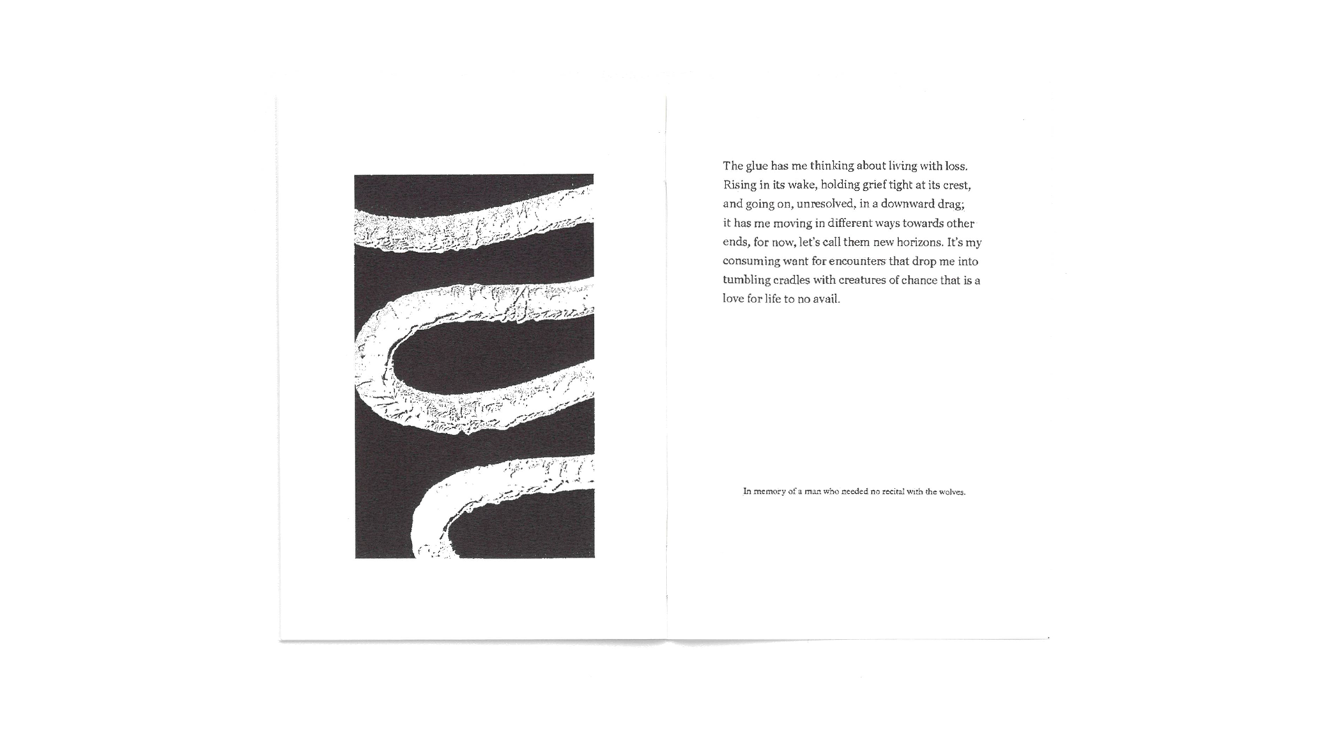
The glue has me thinking about the life of things living with loss. Rising in the wake of loss, holding the grief, and going on, still with that heavy weight of absence, has me moving in different ways towards other ends; let’s call them new horizons. It’s the urgency to be struck by an encounter that drops us into a tumbling cradle with creatures of chance that is a love for life to no avail. I am still, moving.
To journey’s end. In memory of a man that needed no recital with the wolves.
This zine, as such, is a kind of grief literature. Its title, A Falling Has Come, is a play on Owen Barfield’s etymological journey into the word “Ruin”. The story documents the wanderings and mumblings of a man walking around a town not too dissimilar to the place where I lived with Jonny. The protagonist is a paranoid aesthete that finds solace in the dried bits of glue dotted around the streets where he lives; there is something comforting for him in their odd meaninglessness.
In mourning, you repeat the same lines so many times that they start to take on a different form in your mouth, they sound almost insincere, or improper. It’s an effect with many names but it’s often called “semantic satiation”. Mimicking this, the production of the zine involved xeroxing xeroxes, the more copies that are made the more there are artefacts and distortions in the prints. The idea is to replicate the productive destruction of repetition in response to that harmlessly potent question: how are you feeling?
The format of the zine is a 95 x 132 millimetre saddle stitched pamphlet printed on 120gsm paper, which the manufacturer calls Zen. For me, this is a paper of unbalanced contradictions, it is firm but flexible, it is smooth but textured, it is thicker than thin but thinner than thick. The images in the zine are paintings of found glue. The kind of glue I am referring to is variably called Gripfill. It usually comes in a tube, the silicone-like substance is pushed out of a nozzle by a hand-squeezed clamp. It dries cement-hard and is notoriously difficult to remove. The images are tightly cropped to emphasise the absurd closeness of the protagonist's attention and the consequent distance he has from other, more regular, lines of sight.
Lastly, on the construction of the words, this small zine is intended to be read out loud, it is deliberately designed to make issue with breathing. Instead of building sense out of units of beats and measures, the sentences are designed for the reader to stumble, stutter, mumble, and drone, they are there to bring attention to the panting slurs of the writer as they are played out through the breath of the reader. The glue, you will notice, is breathlessly silent, it is a significantly insignificant happening at the heart of the protagonist’s murky, frustrated thoughts. Please, read slowly.

A Falling Has Come
These marks are what’s left behind. They are from odd bits of glue that I’ve seen dotted around. It’s easy to find others like them, they’ll be stuck somewhere on the usual midden of the average town. These flattened shapes don’t tend to call forward the same intellectual reverie that comes with the wayward strides taken across the wastelands of an unofficial countryside, or inspire the same deep topographical reflections at the fringes of underimagined edgelands. Neither do these bits of detail give off the same wholesomeness as the earthy, romantic warmth of those bucolic Constable scenes; they aren’t anything like mossy posts, muddied paths or crooked fences. They don’t even relate satirically to other specific cultural things in the ways that littered fizzy drinks cans or torn posters might do. With these bits of glue, I am turning away from what we often think about the places where we live, when we zoom in on the “man of the crowd” and find some kind of parallax novelty through his eyes. We can imagine, instead, here I am thinking not so much about Baudelaire’s rag picker but, rather, the rag itself. It’s quite banal, really, these little details that have percolated their way to the surface of my waking life.
***
What we’re looking at is dried glue, straightforwardly, just dried glue, and it’s difficult to know a word about this innominate stuff that isn’t a drab matter-of-fact list of physical properties. It’s here, I guess, because it had a job to do and now it doesn’t do that job any more but it is too difficult to get rid of, so the superfluous mark is left stubbornly bonded to this or that surface. But saying it like that makes this all sound too well known and basic and un-mysterious. That means that the opportunity for us to be surprised by it, and other stuff like it that covers the places where we live, is coshed because of our disinterested imagination. Isn’t imagination, after all, just another mode, another register, of knowing things in other ways? Without imagination how can we come to know our “common reality”, as Boris Groys calls it. It’s a reality that this glue confidently shows to be made up of “disfiguration, dissolution and disappearance in the flow of material forces and uncontrollable material processes”, says Groys. Doesn’t that sound just like a song that is so true to life and its necessary finitudes?
***
With nothing to do, I hold myself here in front of these ruinous marks that scar the bricks of these places in the town where I walk. I am lingering and leering from the pavement. It has taken some time, but I’m now almost manically aware of the distinct signatures of glue around this old market town. I feel (much more than I know, anyway) that these remainder-shapes are doing something other than just being stuff that is glibly judged by its lack. These constellations of spreads of glue are dysfunctional; we know they are not working, they are not productive (not in any traditional sense). Rather, the glue is made visible through a loss of commodity, a loss of meaning, message, purpose, design, and things like that. But we don’t need to see them as idle because of their loss. They are literally a zone unoccupied by regular signs of significance and exchange. They are not busy doing anything other than being still and strong with their loss. They have no real business being there. This is what sets them apart from their neighbouring signs for late night barbers, carwashes, emergency exits, and all the others. As it is, the glue is a unique kind of trashy excess. But this is an excess unlike Effie Paleologou’s chewing gum, it is not waste that I am looking at here, instead it is excess, more excess; perhaps something closer to Nina Simone’s “gum”. To me, this glue is an alluring surplus.
***
Usually, when we speculate about something’s otherness, such as its other meanings, relations, and possibilities, we focus our attention on sensible things and serious matters. We can, however, also have a gentler participation with things that are just banally apparent, like the things that are flat in their everyday obviousness that seem to have no sensible call to anything beyond their own self-evident appearance. But thinking with images like this is often thought to be about passing to a depth deeper than the face of the image itself or transcending to dominating heights for a greater overview. So we could say that this way of thinking is a way to surpass the obvious for the non-obvious, the supraliminal for the subliminal, the as is for the as if. We do this as a way of reaching a more final reality of things, or at least that’s what we think we are doing. It’s an odd kind of interpretation, though, that relies on degrees of absence to be able to imagine what is really true, or, perhaps, truly real. What if, instead, we hang around here on this pavement in the dimming edge of a distant street light (the built environment’s twilight) and imagine what is absent by being with what is actually, affectively, here. From this standpoint, we can enjoy being callously literal with that baroque metaphor of looking “behind” the image. Here it is, in plain, open air, we are looking at what is (left) behind; these shapes are what squats back there on the other side of the image, this is the thing we hoped would be so meaningful a discovery, so poignant and enlightening – but not in this twilight.
Contrary to what those common myths promised us, we lose lucidity when we gain the exposure of this dulcet, rock bottom Truth. What we have with this glue, for instance, is something obscene and literally insecure because the fact we are able to look at this mess of splodges and strings of dried adhesive means that they have lost their grip; they have no sense of reason. What we are left with is this bare encounter that is unable hold up anything we normally think to be significantly meaningful.
But whilst this glue, as surplus, really is the form that holds “behind” the message, it does not make it eternal. And just because it is only revealed when the essential (but now unknown) display has come undone, once the sign has been rejected, this does not make it any more truthful. Rather, it is désintégrale, François Dufrene might say. The glue is a phonetic mark void of the conventions of traditionally structured semiotic meaning; an unknown sound without a shape in your mouth. So, we can say that the glue is without depth, which means there is nowhere beyond for the surface to be substituted for. As such, at the moment of encounter (by which I mean this occasion) the glue isn’t obliged to take on an enlightened meaning that is plumbed from some remote depth and drawn forth by deft attention from a high place. I am not trying to make sense of these little details in that way. Rather, my feeling is that the glue, staying just as it is, can set me off fantastically on oddly patterned travels. I’m still grounded here, but I am moved now. I am still moving.
***
I know now that there are ways to encounter this glue as an ongoing journey instead of a collision between parts that ricochet off each other. But if we take seriously that each encounter can really be so moving, I am cautious of sublimating the spreads of glue into some aesthetically sensible quality as if to order them into something more properly respectable. So, let’s not make this parenthetic, lilt-less prattle into something about shifting the glue somewhere else by framing it as a fine image, brightly light. Rather, the drift this glue casts me onto moves more like how Goethe thought of things as symbolic; as not so simply what they are known to be but also as more generally referential, or more relational – I think that’s what I mean; as part of multiple, flowing relations. What is important, then, is our attention, which is to say, how we are attending to this glue. Let’s start first with the fact that as ingredient in these rippling relations, this glue, and I, are not surface, per se, but rather: surfacing.
I imagine these relations filtering gradually into consciousness in the same way as those odd experiences you have when mourning. That is, when a taken for granted bond is broken so many previously insignificant things take on a grander affect. Tess Gallagher wrote about her husband Raymond Carver and how he had gouged the lino in the kitchen when he was gutting a wild fish. After he died, that mark in the lino had the most tender trappings of lost love. You can feel the same abstract grievance with the marks on the arms of your grandmother’s chair, or when the chorus of a song long-forgotten rolls from the windows of a passing car. This useless and unrelated stuff now resonates with you, it has a novel, warm familiarity. But the way these relations move you is not the puppeted movement inspired by a mystical, sparkling aura beckoning you into a tranced march. These are emotions, rather, that are intuitively firm in your imagination but so ungraspable in sensible thought. We want to be closer to what has been lost, so we give ourselves over to the swell of emotions, and drift with them and sink into them. This is what I mean when I say an encounter is dynamic, journeying, flowing.
***
The kind of encounter I am describing is not the same as experience, or at least I want to make a difference between “experience” and “encounter”. The word experience is probably linked more closely to the expert, which is (bluntly) someone that stabilises a happening into practical empirical knowledge. Experiences, in this way, are remade as more sensible occurrences. An expert in love, or accidents, or life for that matter, sounds suspect to me. How can you really codify love, or programme an accident, or master life?
On the other hand, the encounter happens with an unrefined mobility, it’s the cruise of the trouvaille, it’s the sudden fall that we take into love, it’s the blindsided impact of shocking loss. I know there is something dramaturgical that I am describing here, I am only labouring on it so that I can describe how we may be able to make wandering contact with the spirit of what we have lost. And perhaps we may only be able to do that when we are also devoted to being lost on wandering journeys. I’m sunken, falling, mourning; I am still moving.
***
Rain again today, and on this journeying encounter I am tracking back from the instrumental and the routine, distancing myself from experience, and I am instead provoking revision and re-articulation with a deliberate, but non-sensible, sensibility. I am in a familiar place and I am goading the encounter to move me somewhere else. I am faced with this uncomfortable, droning tone of semantic satiation, which is something like an embodied absurdity. This has happened because I have thrust that droll, routine, banality of life to my fore-thought. As such, a queer, asynchronous, oscillating rhythm shows itself. It is like being consciously aware of walking, suddenly you feel this immense complexity and discordance of your limbs; every bend of knee and swing of arm and pivot of hip feels misplaced. You feel as if you are on the edge of collapse until you stop thinking about it. So you stop thinking about it.
Without being aware of these acts (these things set is motion, like this glue and me with it) it’s difficult to know about other sorts of ordinary goings on too. If you think about sitting, or think about blinking, or coughing, you make these automatic, seemingly involuntary things deliberate. The taken for granted becomes an artifice that you are living with and rarely give attention to. Now that it’s a conscious effort, a morose realisation of disorderly confusion takes hold. You feel it, like a visible darkness, the way that meaning is a crass tradition of myths, and now it is quite obviously just there, wearing out, rotting in front of you and it can’t be held back or pushed away because there are no hard edges to it. Back to the glue: when culture is felt by its pernicious thrust, trying to understand its limits, its borders (like this glue) is like trying to push against a barrelling wave. It's a "sea of forces", as Nietzsche had it, "flowing and rushing together, eternally changing, eternally flooding back".
***
I think the glue is equivalent to those oblongs of coloured wallpaper preserved from sun-fading by picture frames hung decades ago. They are those morbidly colourful rectangles on old, kitsch wallpaper in recently-gutted, dusty, carpeted living rooms. Whilst this grubby, scrawl of old glue has no practical meaning – like the trace left by the picture frame – it still holds an arbitrary significance to the diegesis of “the local”. That is to say, it is part of the place, but it is an aspect that is abstract to the regular play of the plot. It’s not what was in the picture frame that hung on the wall that matters. What affects you most are the disquieting reverberations and the modest dimensions of the empty room. It makes you knowingly sensitive to the new geography of the place and where you stand in it. It is not a home any more, rather, it is a new kind of zone where living has happened. It is a zone that seems only to work as a holding place for this solemn atmosphere; as storage for oddly-cut and kindly-tinted memories – those ones that come back to you with the most generosity. The faded rectangles, like the glue, are a semantic derangement, a trace of disappearance. And in the same way, the smears of caulk matter because they put us in a place where what we might anticipate from our experiences are addressed blankly as fading fictions. If you are willing to accept this, you will be open to encounters that make new and uneasy awarenesses necessary.
***
Two characters are speaking in Harold Pinter’s short play Landscape but it can hardly be called traditional stage dialogue. As the characters take turns to speak, an unbridgeable margin is drawn out between their quietly-said lines. They are only really speaking near to each other, across a table, “into the air” as John Durham Peters would say. It’s as if they have stopped trying to be understood or felt and instead they just speak with automatic, but polite, broadcast. The little connection they share is silence. It’s a pause that works as a formal cue for the other to start talking again. Their speaking like this, in a divorced, tandem of fractured monologues, has the appearance of conversation in its rhythm and cadence but there is nothing being shared other than the essential disconnect between the characters. Landscape inspires me to disbelieve communication. It blows up those unsaid but so common disconnections to a scale that can’t be ignored. I see now that the glue is doing the same thing to me.
It says in the notes of the stage directions that each character is “relaxed, in no sense rigid” and “does not appear to hear”. As such, this is not an issue of grammatical comprehension, or conflicting interpretations, or cultural, linguistic or structural differences, it is an affective loss, an unfelt velocity, a too-faint expression of the “voice”. The differences between the characters have nothing to do with the meaning of the words, or the “content” of what is being said. And, more importantly, their differences do not mean they are in some way dismissing or negating each other. Rather, they are always participating in the “play” of their relations.
Isn’t this also what we have when we meet the indelible gloops of glue; the lack of exchange but persistence of participation? I’m keen to preserve the richness of the encounter, but not to let it be judged as something below the real because the attention I give it is so dependent on fabulation. This glue, just as in Landscape’s suspended dialogue, shouldn’t be thought of as something that lacks inherent value just because it is not what it “ought to be” – as the old designers would say. Let’s instead be with what is actual and feel what calls for our attention so that we can hear the voice’s resonance and with conviction be part of the play of things, even if we are ultimately unresponsive to each other, even if we “do not appear to hear”.
***
Anticipation, expectation, rationale, and intention are forestructures; they are bypasses for the rawness of how things really feel. This is why the vivid joy of noticing what Gombrowicz called “little details'' should not be levelled out through compressing explanations, or squinted at through grammar’s tight optics. Henkin would have me “read the city”, but that brings its own sets of rules and codes of comprehension. I don’t want to read the city. Instead, where I am (that is to say my situation) is a pleasure that I feel as part of a journey, not a text waiting to be read.
This town: I want to be affected by its voice, I want to feel the low frequency resonance of its part-tarmacked cobbles, the overtones of its river’s soft colours, and the decaying force of its sandstone walls. I think I do already hear it, now and again, quite faintly though.
***
The glue has me thinking about the life of things living with loss. Rising in the wake of loss, holding the grief, and going on, still with that heavy weight of absence, has me moving in different ways towards other ends; let’s call them new horizons. It’s the urgency to be struck by an encounter that drops us into a tumbling cradle with creatures of chance that is a love for life to no avail. I am still, moving.
***
To journey’s end. In memory of a man that needed no recital with the wolves.
Dimensions: 95mm x 132mm
Paper Stock: G. F. Smith Zen 120gsm
Binding: Saddle Stitch
Paper Stock: G. F. Smith Zen 120gsm
Binding: Saddle Stitch